Visual identity
Typography
Typography is a tool to support audience recognition and express our brand’s personality. To ensure consistency across all communications, ACRRM uses Public Sans.
Public Sans is a strong, neutral typeface for interfaces, text, and headings. It has minimal quirks and a narrow look, making blocks of text comfortable to read. It has nine weights, italics and is available in variable format. Public Sans is very versatile, working well for UI, headlines, and text. Due to the lack of visual quirks, it doesn’t interrupt reading flows. Its neutral tone objectively communicates a message with clarity and prioritises optimum reading experience.
Download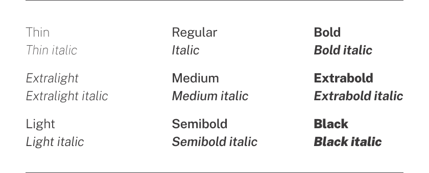
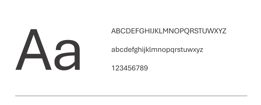
Aptos is a modern sans-serif typeface designed for readability in both digital and print media. It is also compatible with Microsoft Office applications, making it a practical choice for documents and presentations created in Word, PowerPoint, and other Microsoft software. Aptos strikes a balance between legibility and aesthetics, making it a versatile option across different platforms.
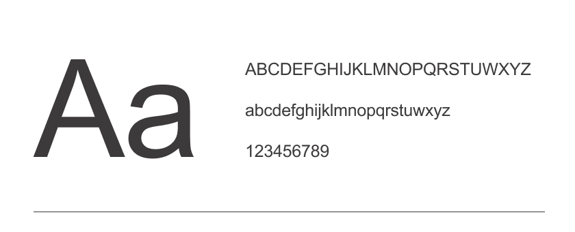
Arial is a highly versatile sans-serif typeface renowned for its clarity and legibility across both print and digital use. It stands out as an excellent choice for digital applications, particularly as a web font, because of its wide compatibility across different browsers and devices.
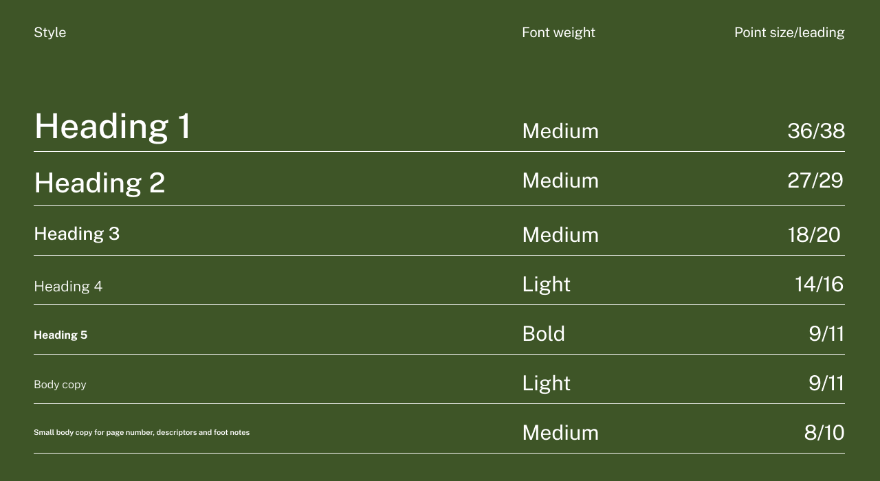
These are the guidelines and standards for using typography in the ACRRM brand identity. This style guide helps to create consistency, clarity, and personality across all visual communication of ACRRM. Please ensure you use the headings and body copy according to the example below.
If you have any questions regarding the brand guide, please contact:
Wendy Hovell – Graphic Designer
P: 07 3105 8211
E: w.hovell@acrrm.org.au
